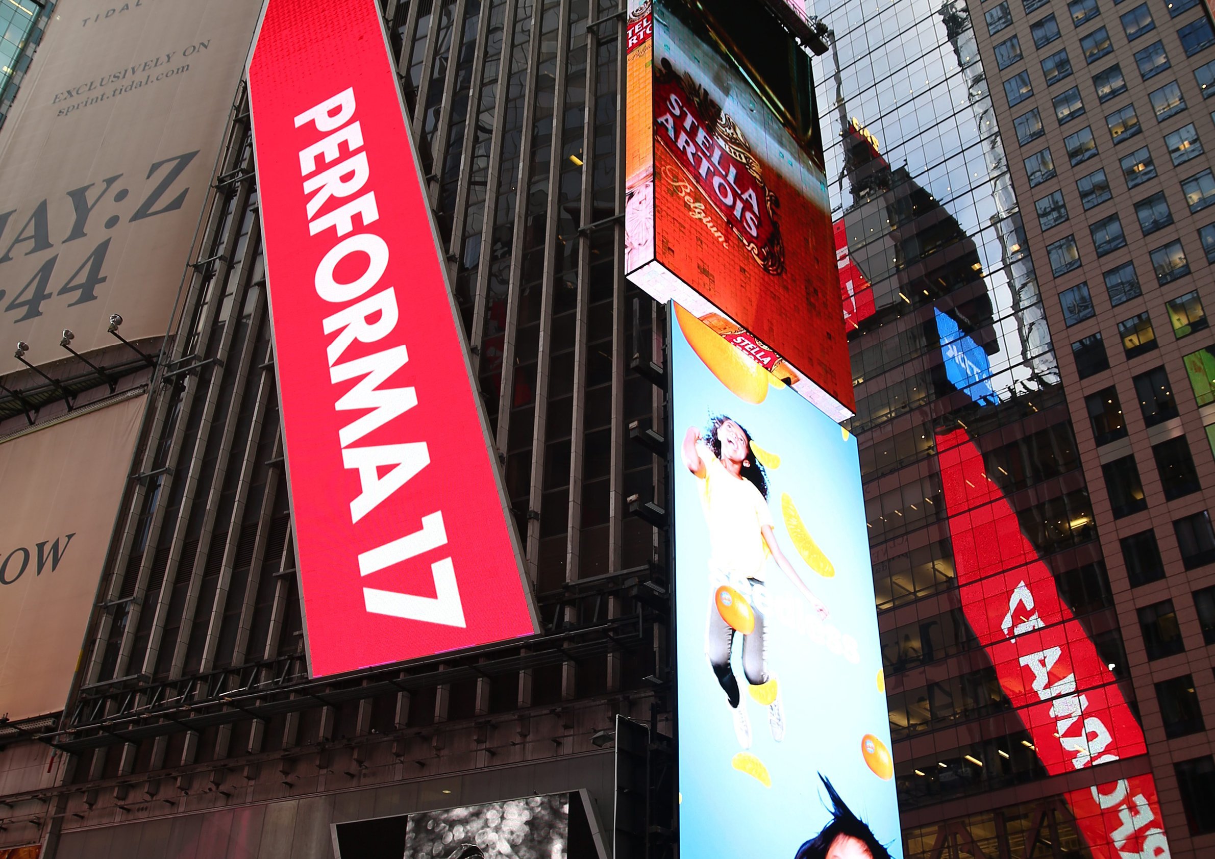
For the 2017 edition of the Performa New York performing arts festival, I worked with Barbara Kruger — a participant in the year’s festival — to take her iconic style and craft it into the identity.
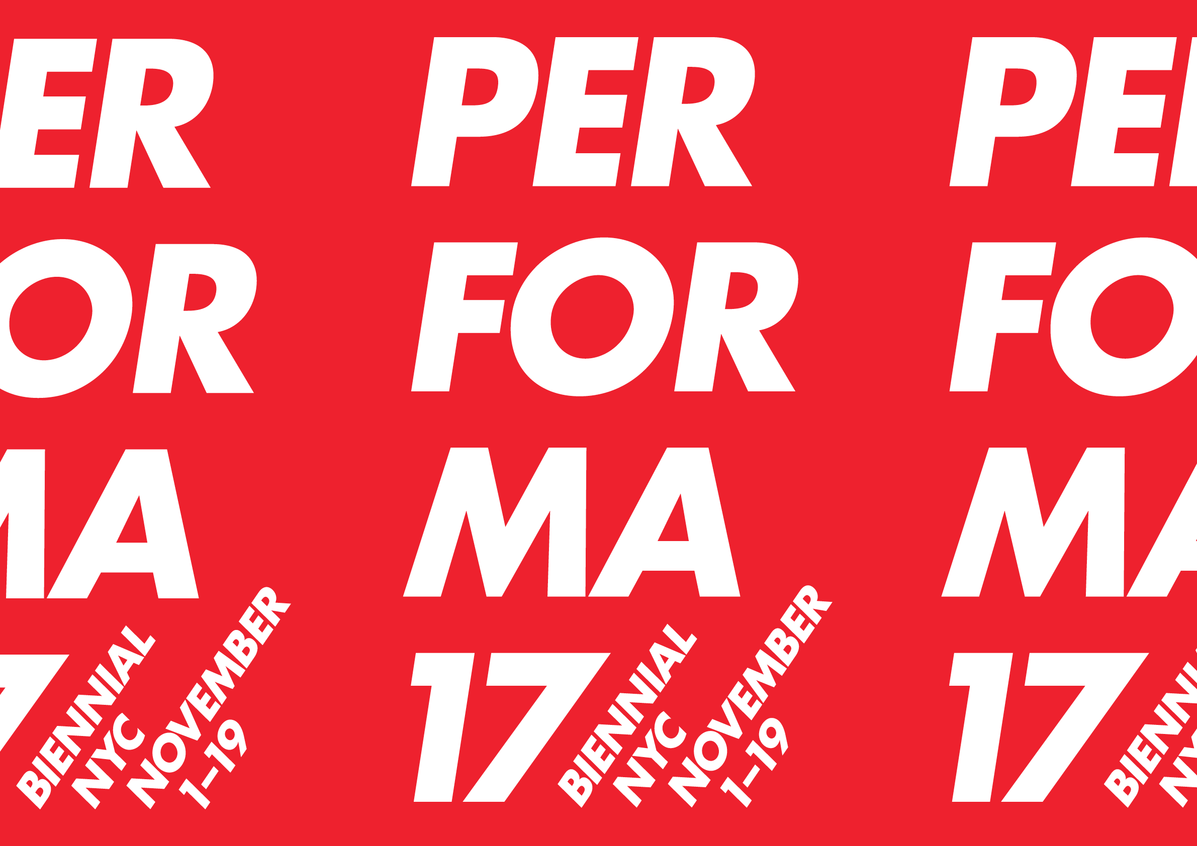
One of the things we wanted to explore is where performance can intersect with elements outside the norm of the medium, and with graphic design and language in particular. Thus, “Performa” is visually split into syllables, almost reflecting a diagram to speaking it out loud in rhythm: “Per” — ”for” — ”ma.”
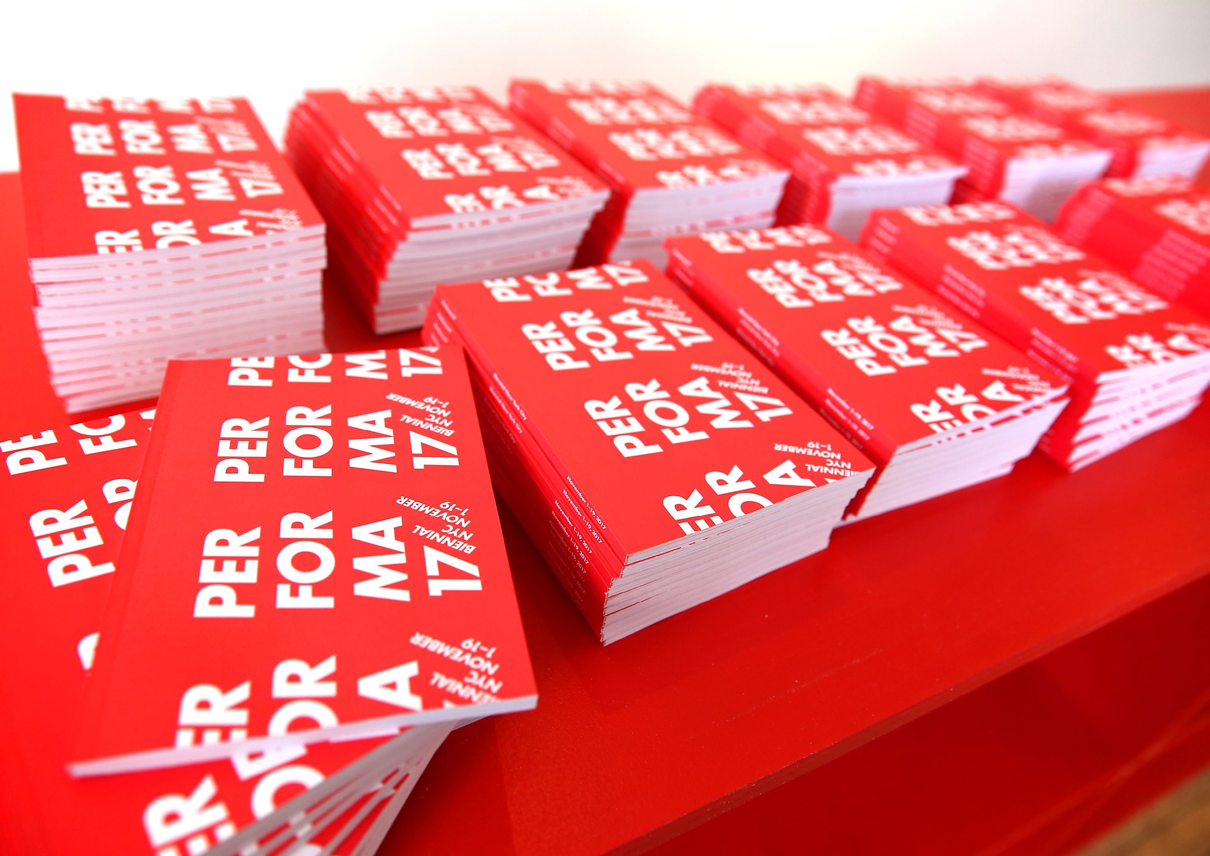
Carefully cropped repeating logotypes were applied to collateral such as the book and posters, allowing for easy large-scale branding of the various performance spaces (many of which were temporary) using existing materials.
Repeating diagonal patterns were also applied at a micro level throughout, using the 57° angle of the italic “7” as a guide, adding an additional axis of motion.
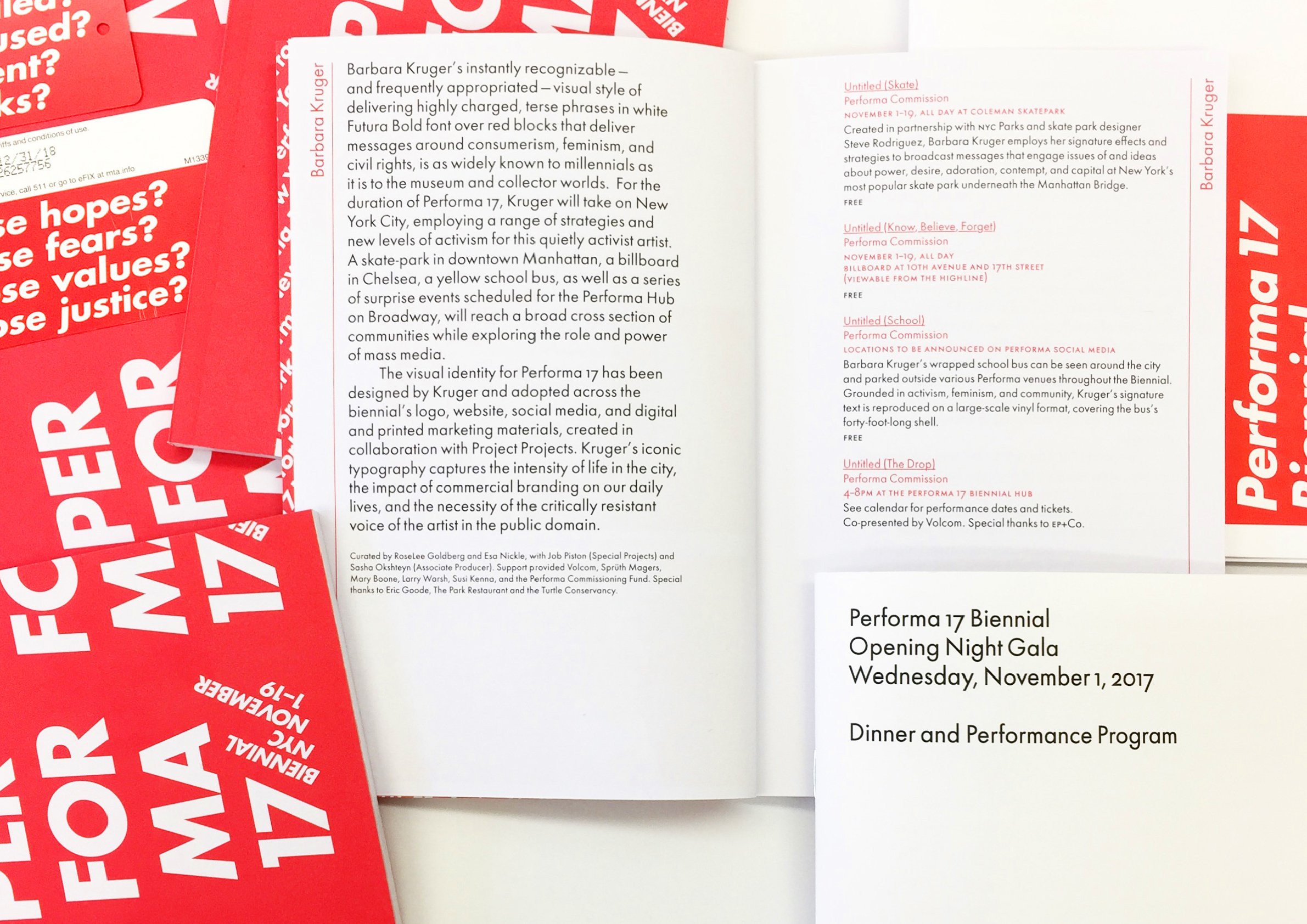
Text-level type was set in a special cut of Futura by Elsner+Flake that offers many subtle typographic amenities not present in the “standard” Futuras, allowing for a quiet and crafted interior in materials like programs and the book — and giving space for the primary logotype to shout loud and clear and bright.


